


Why Liquidity is the Crystal Ball of the Stock Market (with Python Code)


Cordell Tanny has over 23 years of experience in financial services, specializing in quantitative finance. Cordell has previously worked as a quantitative analyst and portfolio manager for a leading Canadian institution, overseeing a $2 billion multi-asset retail investment program.
Cordell is currently the President and co-founder of Trend Prophets, a quantitative finance and AI solutions firm. He is also the Managing Director of DigitalHub Insights, an educational resource dedicated to introducing AI into investment management.
Cordell received his B. Sc. in Biology from McGill University. He is a CFA Charterholder, a certified Financial Risk Manager, and holds the Financial Data Professional charter.
Subscribe to trendprophets.com to start creating long-term wealth today!
Introduction
Approximately 10 years ago, I was given the opportunity to oversee a $2 Billion CAD multi-manager mutual fund program. I was also fortunate to work for a Chief Investment Officer (CIO) who was not only a great economist but also excelled at translating economics into investment strategy — a skill that many economists lack. Every two weeks, the Asset Mix Committee would meet to pore over hundreds of charts and research findings, deciding how to adjust our tactical asset allocation. These decisions impacted my funds, as I had to execute futures transactions to adjust our target weights among various asset classes.
While I was not on the committee, I was invited to listen and learn. I absorbed everything like a sponge and kept many of the slide decks. Over the years, I’ve diligently tried to reproduce the many graphs in Python. But there was one graph the CIO would always present, emphasizing its importance. It showed how equity markets follow global liquidity by about 6 months, illustrating that liquidity and financial conditions dictate everything.
After witnessing the impact the Fed has had on the markets over the past two years, this revelation should not come as a surprise to anyone. Yet, here you are, reading Medium articles where it seems everyone is outperforming the S&P 500 with machine learning — so, how useful can these “dinosaur methods” be?
Guess what? 99% of what you read is nonsense. No one is beating the S&P 500 with deep learning models based solely on prices. If they were, they wouldn’t be sharing it; they’d be starting a hedge fund and making billions.
If you aspire to be a better investment strategist, consider learning how to follow some reliable indicators (and perhaps incorporate these indicators into your machine learning models).
Introducing the Financial Conditions Impulse on Growth Index
The challenge with financial conditions indexes is that they tend to be proprietary and not freely available. The most commonly used one is the Goldman Sachs Financial Conditions Index. Bloomberg also offers one, accessible via the terminal through the financial conditions dashboard using the function <FCON> (note: I haven’t used a terminal in about 4 years; this might have changed).
Fortunately, the Federal Reserve Bank of St. Louis publishes an index based on a research article they authored a few years ago. They provide a detailed breakdown of the components and how it is calculated. Published monthly, you can download a CSV with all the values. However, it’s important to note that this is not an official economic indicator, and it could change or be discontinued at any time (though I certainly hope not).
Link: A New Index to Measure US Financial Conditions
We will plot both series:
The baseline, which incorporates three years’ worth of data from the components.
The one-year lookback period series, which uses only one year of previous data in each reading.
We will plot this against the closing price of SPY, lagged by 6 months. Why lagged? As my mentor stated, financial conditions usually lead stock market prices by about 6 months.
And here are the results (code below):
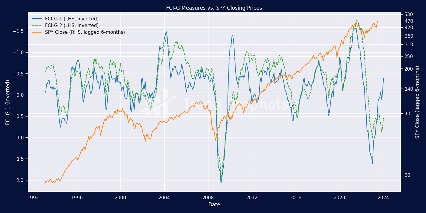
We plot the SPY on a log scale so that percent changes appear consistent over time. The correlation is evident! Whenever the FCI-G (plotted on an inverted axis since negative values indicate loose monetary conditions) crosses into negative territory, this signals loosening conditions, which are positive for equities. Looking at current conditions, get ready for a significant rally!
Conclusion
All investors should keep an eye on global liquidity and financial conditions. Their predictive power over equity markets is indisputable. While it’s easy for quants and machine learning experts to become enamoured with our models, classic indicators used by investment strategists for decades cannot be replaced. Think of all models as golf clubs in your bag; while you might not need every club every time you play, you’ll be glad to have it when you do.
I am on a mission to help people become better investors and share my 25 years of experience in quantitative finance. I hope you enjoy what I write, and I love when people leave comments.
If you like my articles, follow me here on Medium, or on LinkedIn, or even better, join us today at Trend Prophets and see how we will help you create long-term wealth!
from matplotlib import ticker
import yfinance as yf
import pandas as pd
import matplotlib.pyplot as plt
import seaborn as sns
import numpy as np
from dateutil.relativedelta import relativedelta

sns.set()

# load the fci-g information
df_fcig = pd.read_excel('fci-g.xlsx', sheet_name='fci-g', index_col=0, parse_dates=True, header=0)
df_fcig = df_fcig.resample('M').last()

# simple plot of fci-g data
df_fcig.plot()
plt.show()

# Determine the start and end dates based on the FCI-G data
start_date = df_fcig.index[0] - relativedelta(months=1)
end_date = df_fcig.index[-1]

df_spy = yf.download('SPY', start_date.date(), end_date.date())['Adj Close'].to_frame(name='SPY')
df_spy.index = pd.to_datetime(df_spy.index)
df_spy = df_spy.resample('M').last()

df_merged = pd.concat([df_fcig, df_spy], axis=1).dropna()
# Examine the merged df
print(df_merged.tail())

def plot_fci_g_and_spy(dataframe):
    """
    Plots two FCI-G measures against SPY closing prices on a dual-axis graph. The FCI-G measures are plotted on the left y-axis (inverted),
    while the SPY closing prices are plotted on the right y-axis, adjusted for a 6-month lag and displayed on a logarithmic scale.
    The function adds custom branding colors, a horizontal reference line at y=0 for FCI-G, and combines legends from both axes with black text color.

    Parameters:
    dataframe (DataFrame): A pandas DataFrame where the first two columns are FCI-G measures and the third column contains SPY closing prices.

    Returns:
    None: Displays the plot directly without returning any object.
    """

    # Set up the figure and axes
    fig, ax1 = plt.subplots(figsize=(14, 7))

    # Plot the first FCI-G measure on the left y-axis with custom label and color
    color1 = 'tab:blue'
    ax1.set_xlabel('Date')
    ax1.set_ylabel('FCI-G 1 (inverted)')
    ax1.plot(dataframe.index, dataframe.iloc[:, 0], color=color1, label='FCI-G 1 (LHS, inverted)')
    ax1.tick_params(axis='y', labelcolor=color1)

    # Plot the second FCI-G measure on the same axis with a different style
    color2 = 'tab:green'
    ax1.plot(dataframe.index, dataframe.iloc[:, 1], color=color2, label='FCI-G 2 (LHS, inverted)', linestyle='--')

    # Invert the y-axis for FCI-G to reflect its negative correlation with market stress
    ax1.invert_yaxis()

    # Add a horizontal line at y=0 as a reference point
    ax1.axhline(y=0, color='red', alpha=0.3)

    # Create a second y-axis for SPY closing prices, shifted for a 6-month lead
    ax2 = ax1.twinx()
    color3 = 'tab:orange'
    ax2.set_ylabel('SPY Close (lagged 6-months)')
    ax2.plot(dataframe.index, dataframe.iloc[:, 2].shift(-6), color=color3, label='SPY Close (RHS, lagged 6-months)')

    # Set the SPY axis to a logarithmic scale
    ax2.set_yscale('log')

    # Define specific tick locations you want to display
    # Calculate tick locations, ensuring they start from a minimum positive value and cover the SPY data range
    min_spy = dataframe['SPY'][dataframe['SPY'] > 0].min()  # Minimum positive value of SPY
    max_spy = dataframe['SPY'].max() * 1.1  # Slightly above the maximum to cover the range

    # Generate tick locations and round up to the nearest 10, ensuring they're within the SPY data range
    tick_locations = np.ceil(np.linspace(min_spy, max_spy, 10) / 10) * 10
    tick_locations = tick_locations[tick_locations > 0].astype(int)
    ax2.set_yticks(tick_locations)

    # Use a custom formatter to ensure tick labels are shown as integers
    ax2.get_yaxis().set_major_formatter(ticker.FuncFormatter(lambda x, _: '{:.0f}'.format(x)))

    # Set tick label colors to white
    ax2.tick_params(axis='y', which='major')  # Apply to major ticks
    ax2.tick_params(axis='y', which='minor', bottom=False, top=False)

    # Combine legends from both axes with black text color, no frame around the legend
    lines, labels = ax1.get_legend_handles_labels()
    lines2, labels2 = ax2.get_legend_handles_labels()
    legend = ax2.legend(lines + lines2, labels + labels2, loc='upper left', frameon=False)

    # Set title and adjust layout for clarity
    plt.title('FCI-G Measures vs. SPY Closing Prices')

    # Adjust layout to prevent overlap and ensure clear presentation
    fig.tight_layout()

    # Display the plot
    plt.show()

plot_fci_g_and_spy(df_merged)